Mayday Gothic
A type family in three styles, built for the street and the press. Scarce in material. Abundant in conviction. Mayday Gothic duplicates, economizes, and makes do, because that's what the workers did.
THE QUICK BROWN FOX JUMPS OVER THE LAZY DOG
THE QUICK BROWN FOX JUMPS OVER THE LAZY DOG
THE QUICK BROWN FOX JUMPS OVER THE LAZY DOG
About the typeface
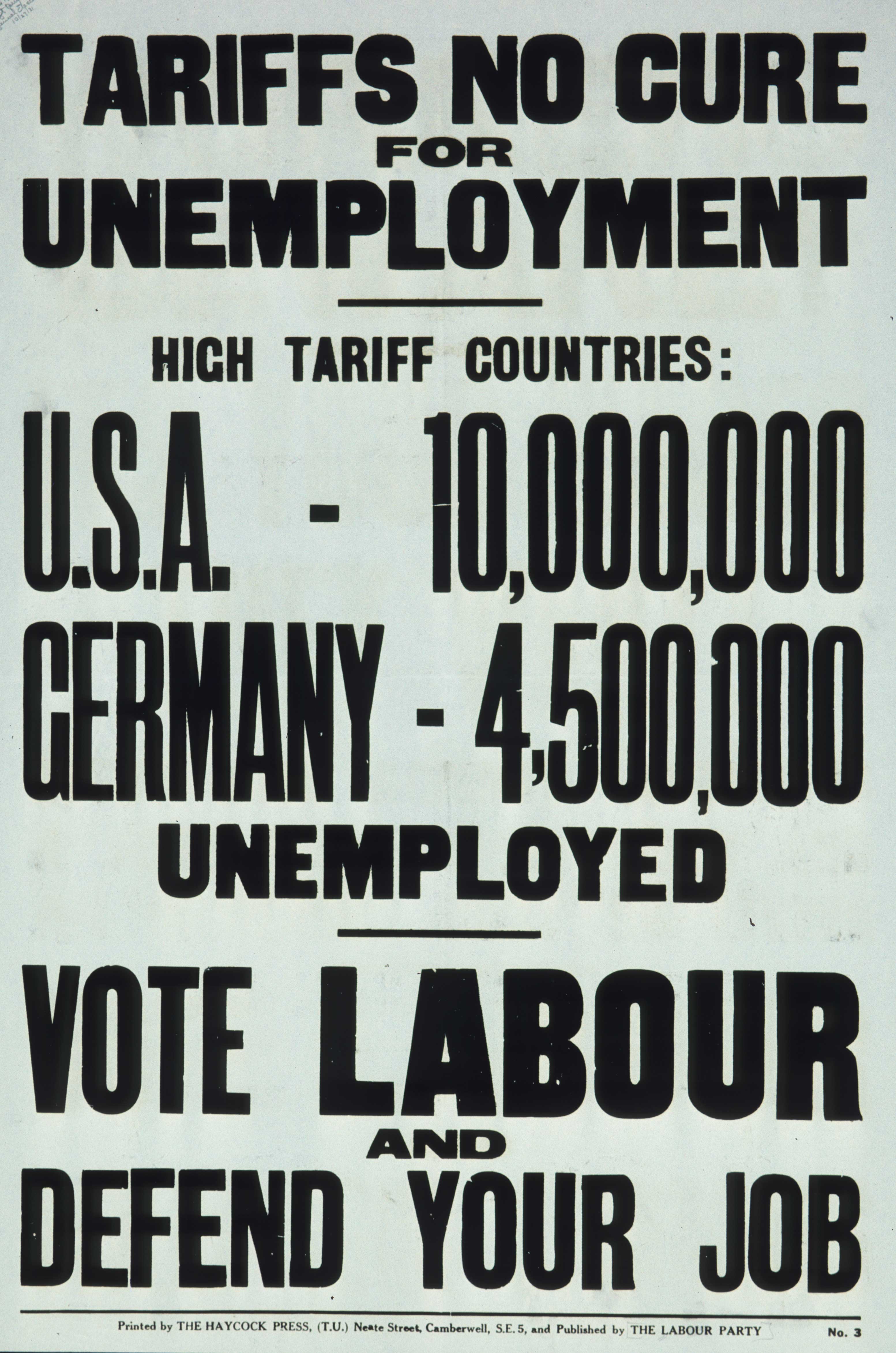
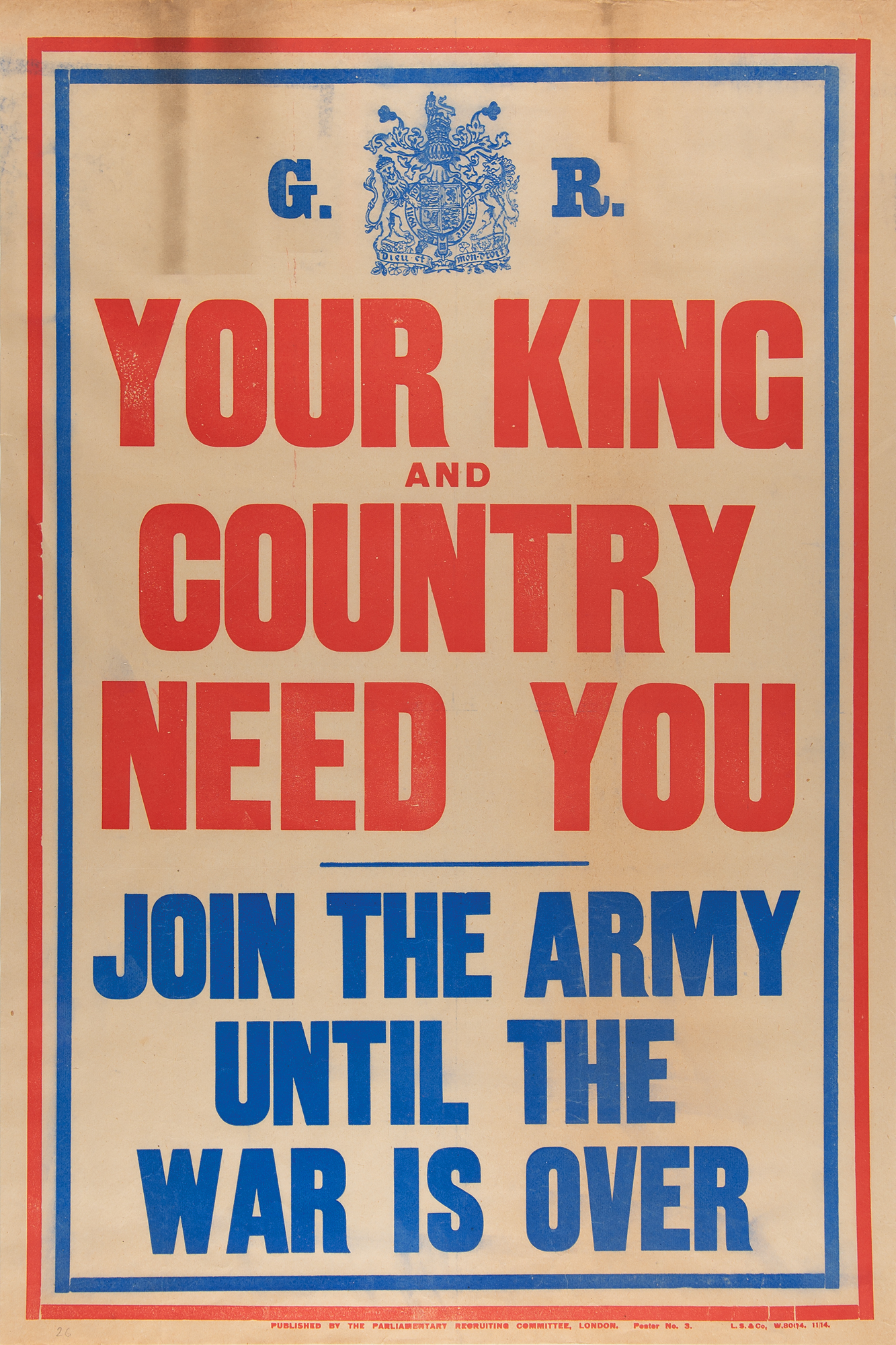
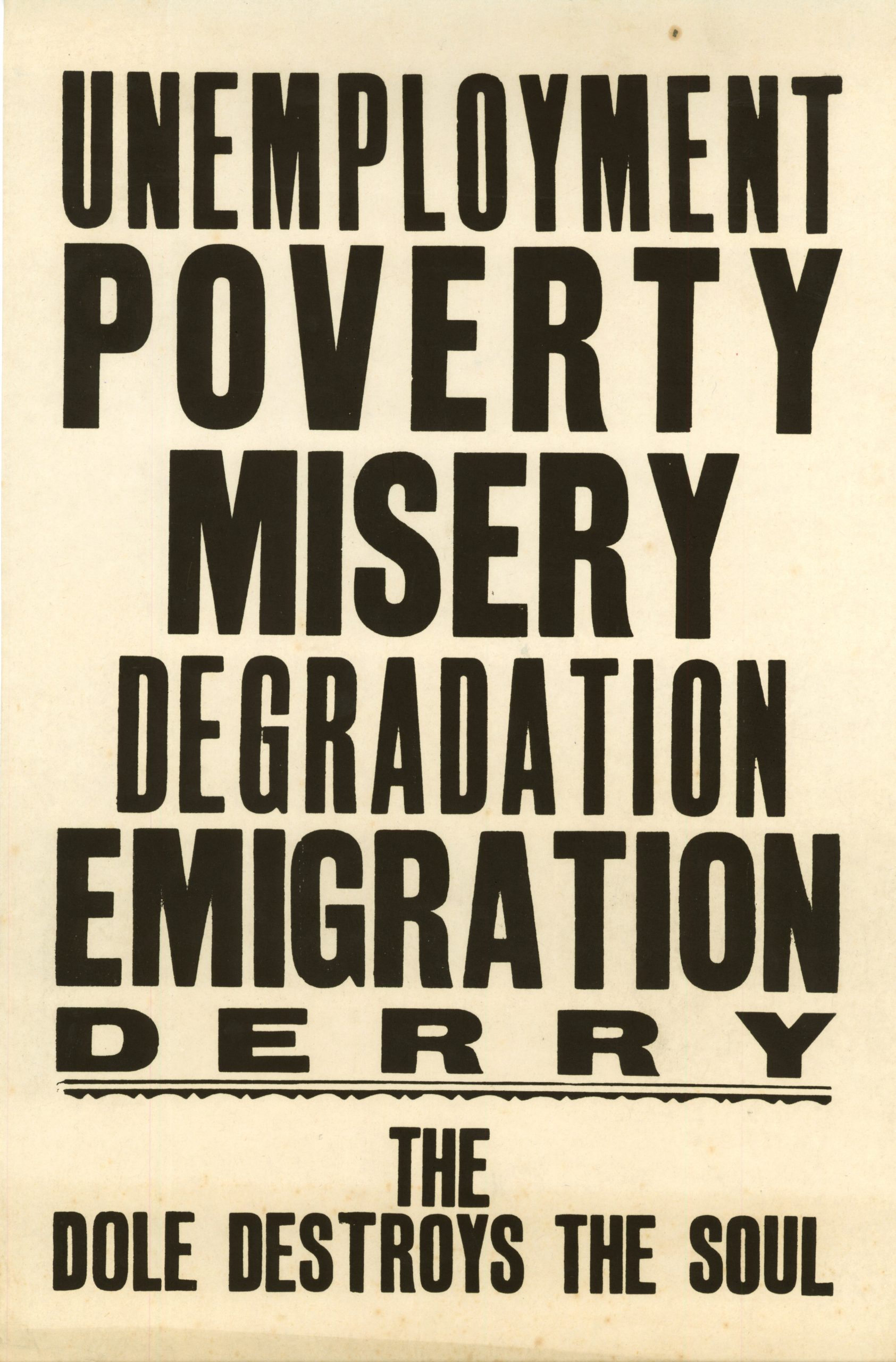
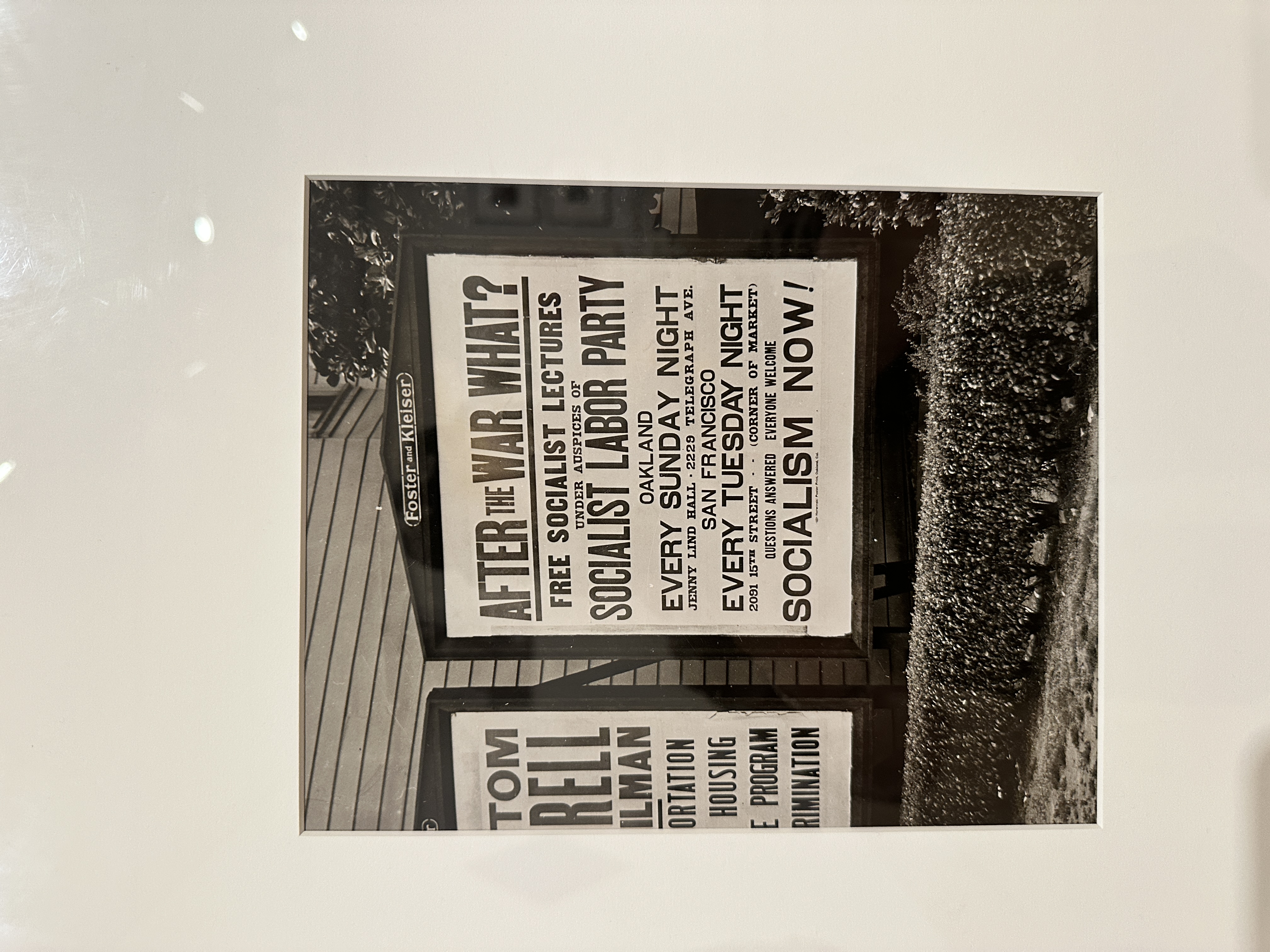
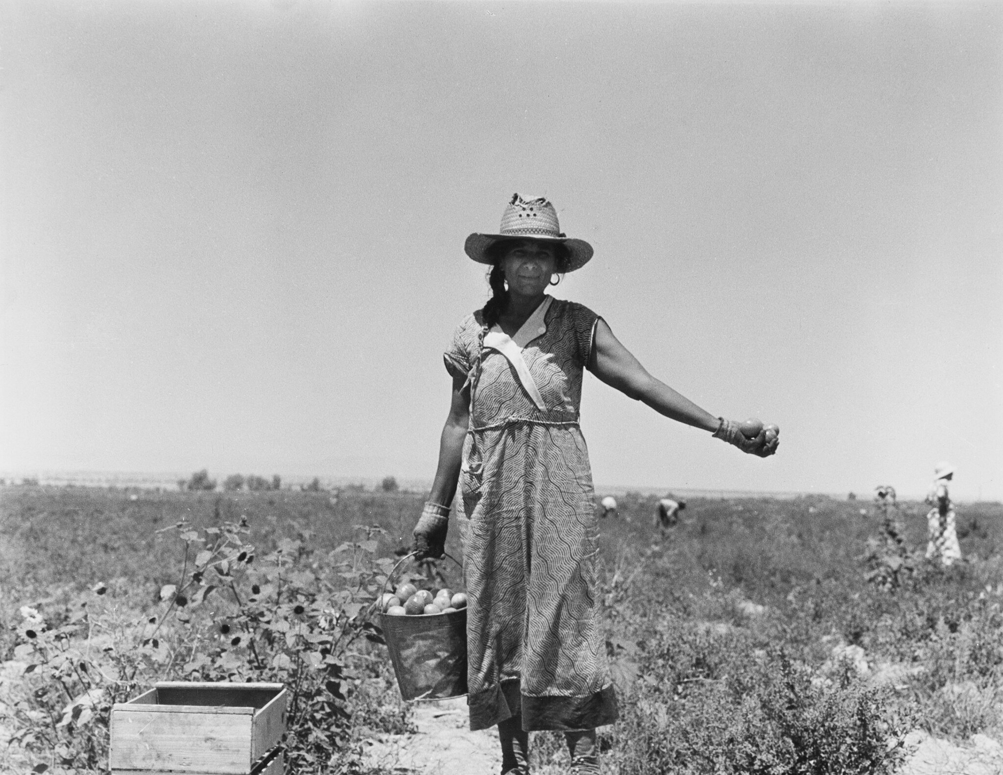
Woodblock type doesn't apologize for itself. The political posters of the Great Depression were made under constraint: limited type, limited ink, limited time, and a message that couldn't wait. Printers pulled from whatever was in the drawer, doubled up letterparts to fill gaps, and produced work that was rough, direct, and impossible to ignore. Mayday Gothic is drawn from that tradition. Researched through Tiny Press in London, eBay, Dorothea Lange's photography at the Oakland Museum of California, and museum visits, the family arrives in three styles: Gothic, Western, and Tall. Each is distinct. Together they function as a system, with enough variation to create hierarchy and enough shared logic to hold together. The letterforms are built on postwar scarcity principles: duplicated parts, high uniformity, and the quiet satisfaction of a grid that knows its own rules.
The story behind it
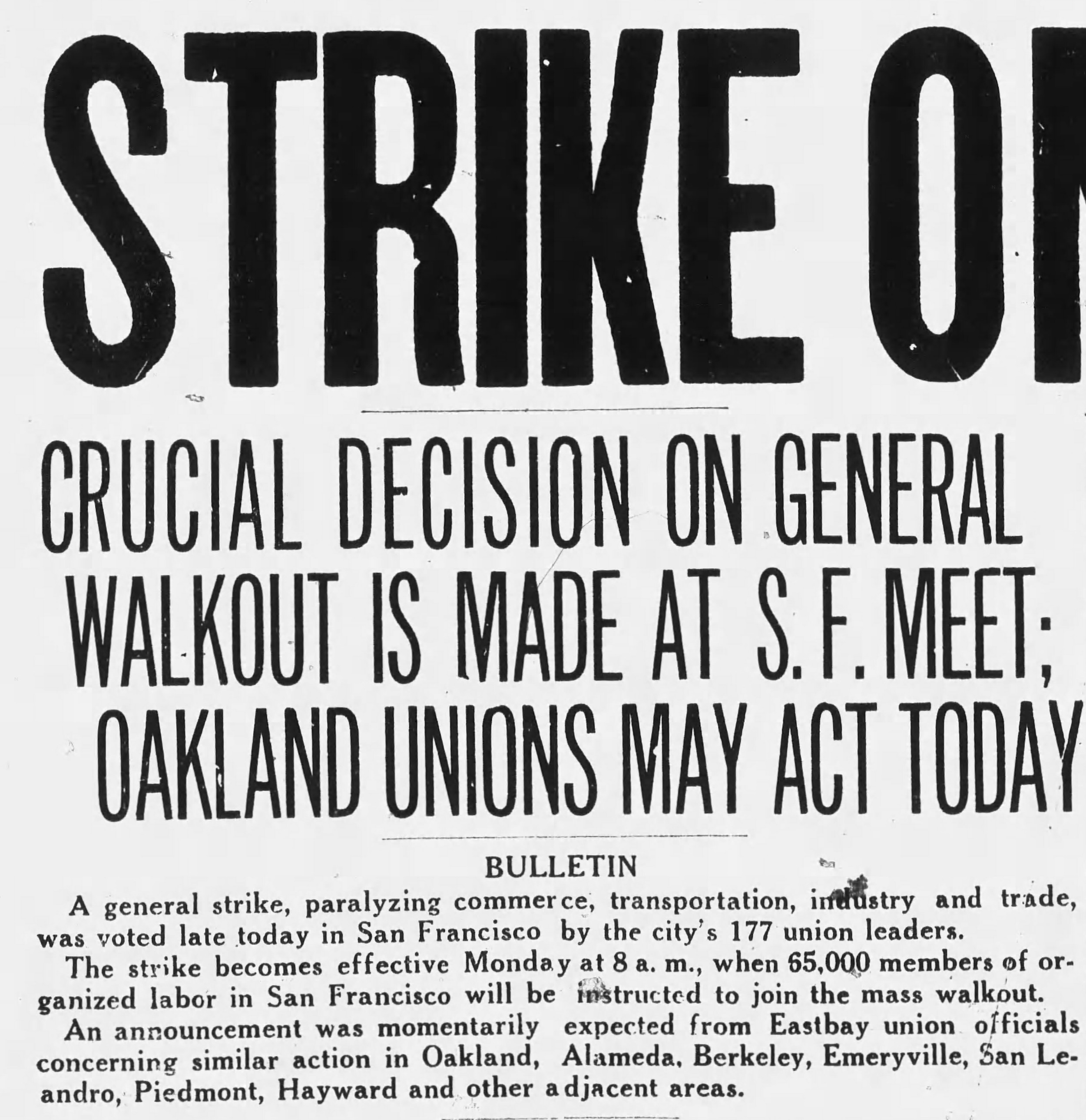
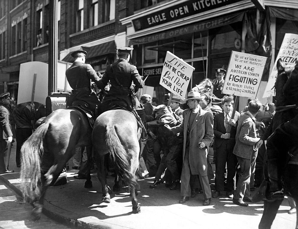
Every year, I design a Mayday poster. In 2025, the poster commemorated the 1934 San Francisco General Strike. For four days in July, longshoremen, teamsters, and workers across the city shut the port and the streets down together. It held against violence, red-baiting, and National Guard troops. It's still worth remembering. The poster needed type that didn't exist yet. Mayday Gothic was designed in under 24 hours, all three styles from scratch, built fast and built to work together. The deadline wasn't incidental. It was the point. The family has since been released to the public.
Designed as a system and best seen as one. A specimen is available.