Becher
An experimental display typeface in progress, drawn from the photographic archive of Bernd and Hilla Becher. Industrial in origin. Typological by design.
A B C D E F G H I J K L M N O P Q R S T U W Y
About the typeface
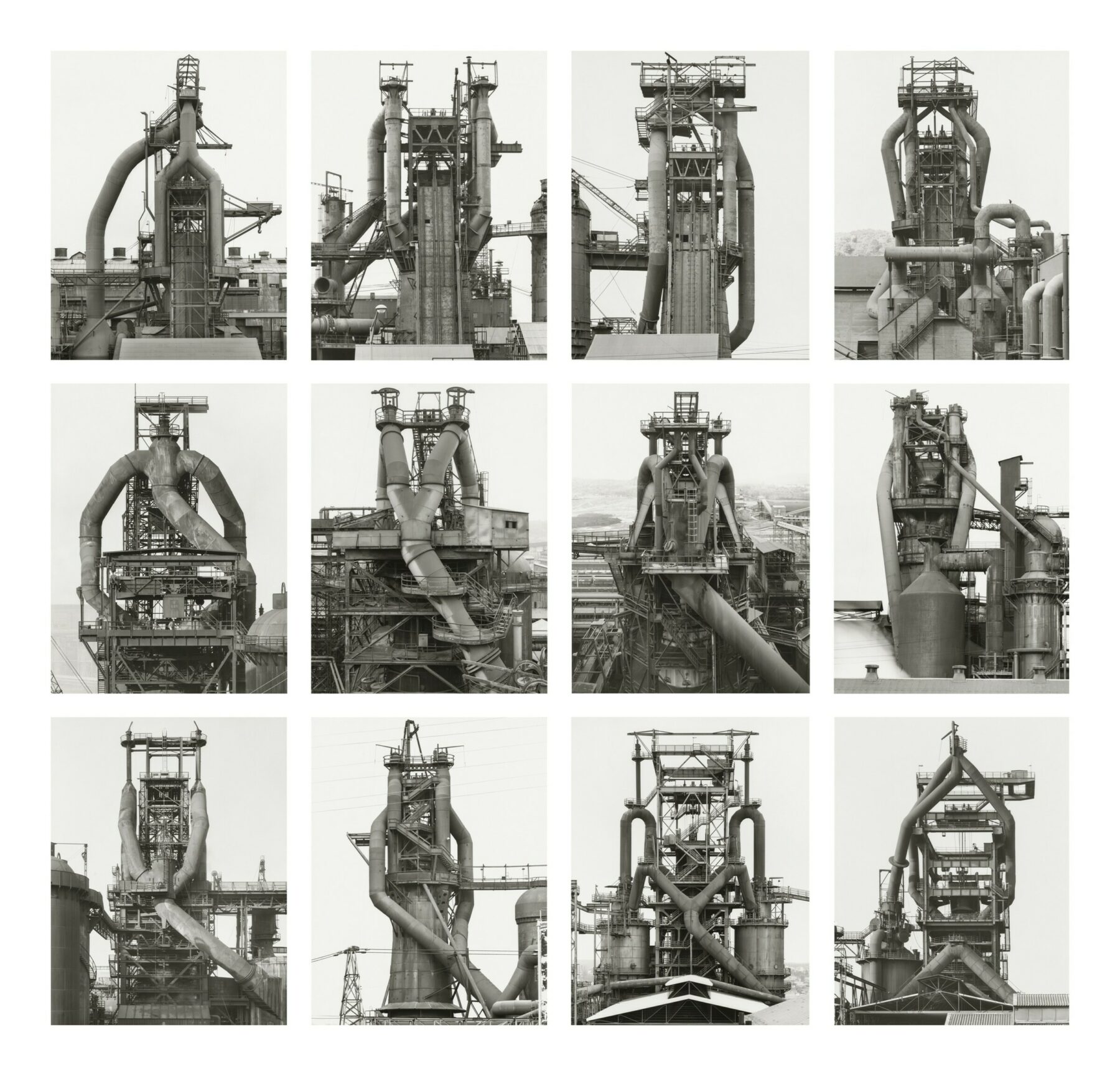
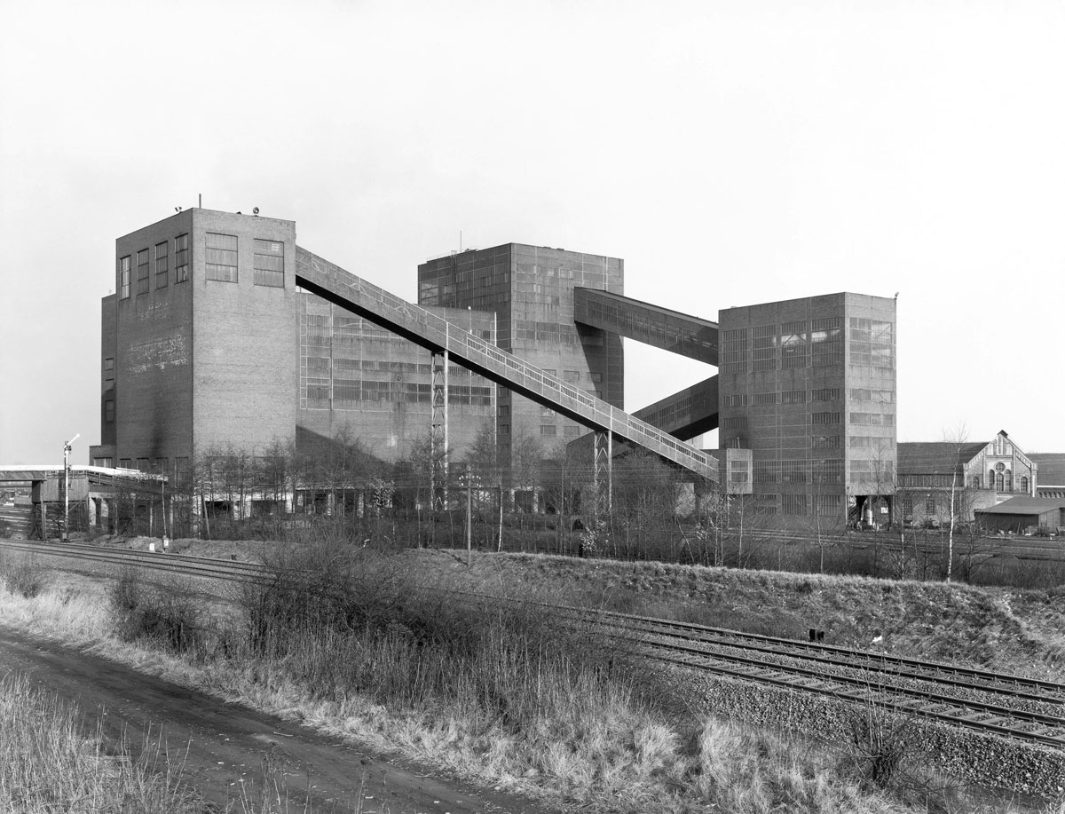
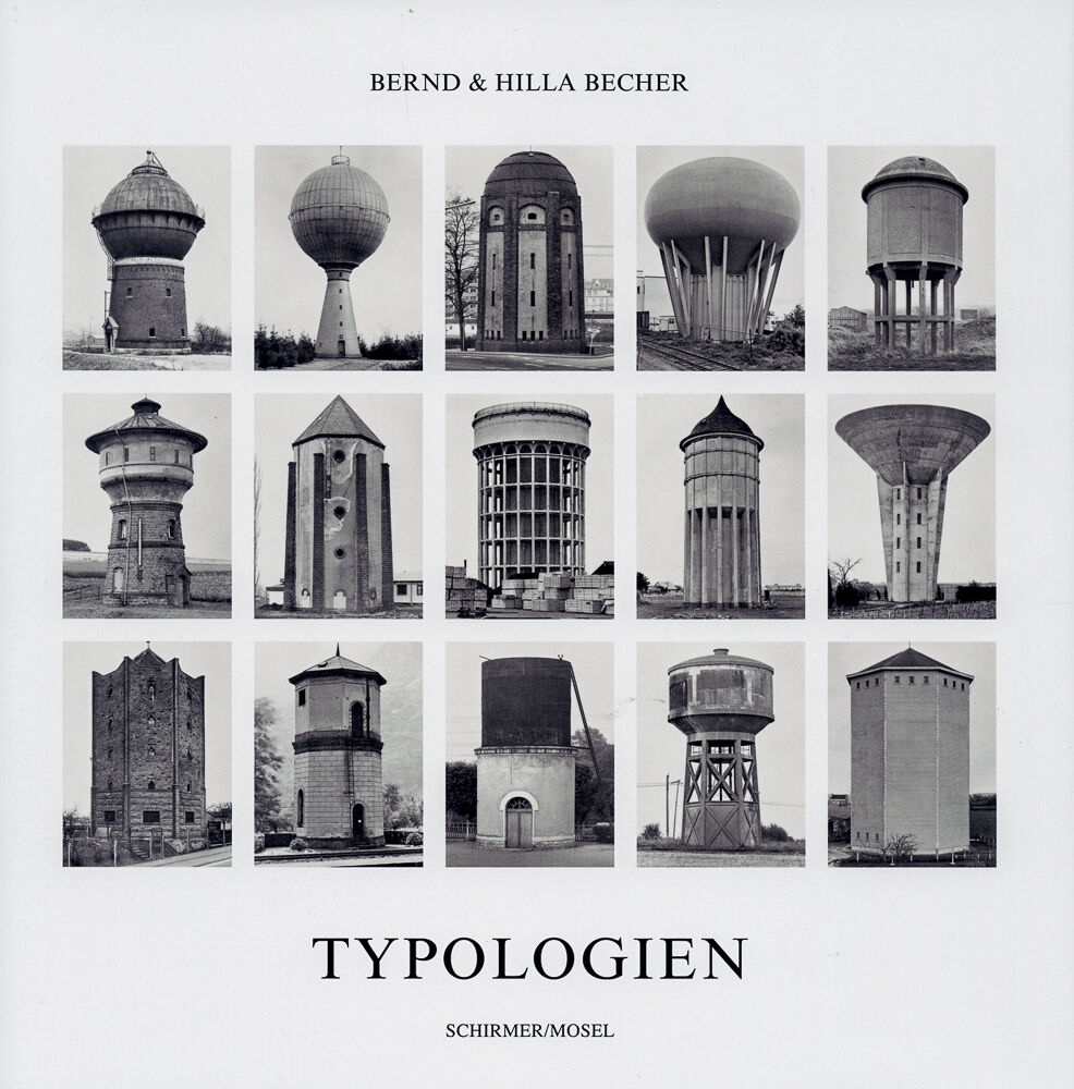
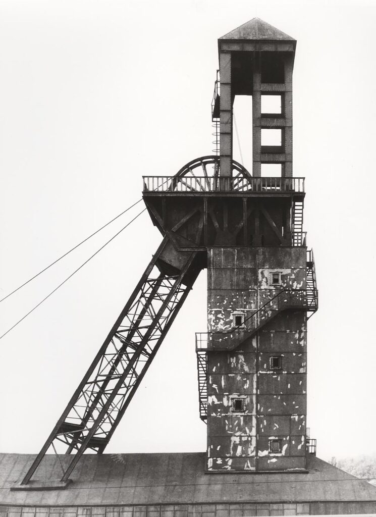
The Bechers didn't make portraits. They made inventories. Their lifelong project was simple in ambition and staggering in execution: photograph industrial structures across Europe and North America, always under flat grey skies, always head-on, always the same. Water towers, coal bunkers, blast furnaces, winding towers. The result was a body of work that treated industrial architecture as a typology, a system of related forms that could be compared, classified, and read as a visual language. Becher the typeface inherits that logic. Each glyph maps a Latin letterform onto an industrial structure chosen for its formal correspondence. The curved bulk of a gasometer becomes a bowl. The stark vertical of a headframe becomes a stem.
The story behind it
This typeface didn't start with typography. It started with a photograph of a water tower. Bernd and Hilla Becher met as students in Düsseldorf in the late 1950s and spent the next four decades building one of the most methodical bodies of work in the history of photography. They were not documenting industry out of nostalgia. They were treating it as sculpture, as vernacular architecture, as a lexicon of form that modern life had produced without intending to. In 1976, Bernd took the chair in photography at the Kunstakademie Düsseldorf, where he taught until 1996. The students who passed through that program became the Düsseldorf School: Andreas Gursky, Thomas Struth, Candida Höfer, Thomas Ruff. Becher the typeface is a direct continuation of that method. Each character is a finding, not a fabrication.
Becher is currently in development. Enquire about licensing.
Download